Updated 9/21/17: eliminated some redundancy with prior posts.
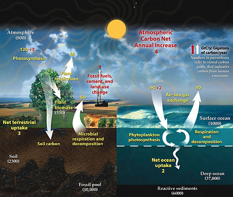
Green tactics I. The Greens employ a bunch of scare tactics to make their points, which I regard as scientific charlatanism. One of their most popular ploys is misdirection. They present data in ways that imply particular conclusions that are not justified by the data. One of my favorites is the following diagram of the Carbon Cycle:
 You will note that human emissions are labeled in bright red. Usually red is associated with danger, so by choosing that color, the Greens are already saying there is something bad about that. It is also associated with the idea of halting something (e.g., stop signs and red OFF buttons), so it is subliminally suggesting Man should stop doing that. It also stands out starkly on the picture, so it emphasizes Man’s role. You will also note the red +3 and + 2 on the two photosynthesis paths out of the atmosphere. The Greens indicate the planet is desperately trying to compensate for Man’s boorishness, but can’t quite do it, right?
Why not label Man’s CO2 in yellow and label, say, plant respiration in red? A 4% increase in plant respiration would account for the annual surplus. Why aren’t we blaming evolution in those damn plants for global warming? The Greens would argue that the natural processes aren’t changing but we know Man is burning more hydrocarbons since the start of the industrial revolution. Alas, that is only half true. We know from the geologic record that the natural processes are changing constantly and they are rarely in balance. We also know that Man has been deforesting the planet in favor of high-growth agricultural crops with higher respiration. So why couldn’t increased plant respiration be the problem?
That segues to another issue for this diagram — the numbers are gibberish! In fact, no one knows what the contributions of photosynthesis and various respirations are. At best we can only make wild guesses that would have -50/+300% error envelopes because no one has measured those things on a planetary scale. However, we do know two numbers in the diagram with considerable accuracy: the total CO2 in the atmosphere and Man’s contribution through burning hydrocarbons. Man’s direct contribution is actually 30b tons, not 9b. And the total CO2 in the atmosphere is 2.06×10**15 tons, not 8.0x 10**11 tons. Those real numbers are completely inconsistent with everything else on the diagram. The bottom line here is that you cannot believe anything this diagram is saying quantitatively.
Alas, I have tried to find the original source of this diagram to find out what is going on without success. All the references are circular; they just point to other web sites with the same diagram. Given how far off the known numbers are, I strongly suspect somebody simply made up this diagram for the sole purpose of blaming Man’s burning hydrocarbons for global warming.
Green tactics II. The IPCC sponsors and publishes research on climate as well as assessing risks in climate change. Having such an organization is probably a really good idea because we should understand what is happening around us when it can affect us in significant ways, like rising sea levels drowning coastal cities. The problem with IPCC, though, is that it is the mouthpiece for the Green Movement. It is dominated by meteorologists who now call themselves climate scientists. They focus on atmospheric CO2 being the root of all the Earth’s problems for the same reason that when one’s only tool is a hammer, one tends to see the world in terms of nails. As such, the most charitable thing I can say about their science is that they are extremely selective about what science they sponsor and publish.
A good example is measuring the Gulf Stream. Oceanographers started measuring this circulation in the ’80s because the models indicated it was driving Ice Ages and those models predicted a return to Ice Age temperatures by 2150 (that date is substantially closer now, like 2050). Oceanographers measured the salinity (density) and actual volume flux (volume of fluid moved per unit time) in situ (i.e., in the oceans themselves). They concluded the Gulf Stream started to slow down in the late ‘80s, and the flow dropped more than 30% since ’00.
Alas, this is news that IPCC does not want to hear because it says we need to buy snowshoes rather than bathing suits. So what we see in the IPCC publications are two different studies. One measured surface velocity and the other measured surface height using satellite imaging. These reports concluded that there is a lot of variation in the Gulf Stream over time that could account for any variations noted in other measurements. Therefore, there is no evidence the THC is actually slowing.
Thus, IPCC promotes two studies that didn’t even measure volume flux directly and it never mentions the studies that did so directly and in situ. Consequently, IPCC has issued a position paper that dismisses the shutdown of the Gulf Stream. That is selective science. Worse, the models IPCC runs on the THC use inputs that are patently unrealistc, such as temperature increasing by 3-4°C when CO2 doubles from 200ppm to 400ppm and they do not account for massive heat transfers from Equator to poles; instead they use precipitation/evaporation models to describe the THC. (Since 1800 CO2 increased 60%, yet temperature went up less than 1°C.)
There are serious problems with Greens controlling organizations like IPCC. One is that they can control the media. When a reporter wants to research climate for a piece, where would the reporter logically go? Obviously to the people who are experts in the subject matter. Where are they? At organizations like IPCC, WMO, and NOAA. But those organizations are dominated by climate scientists (nee meteorologists) who are Greens. The result is the media dutifully reports the Green Party Line, even though the journalist did due diligence in getting the facts from experts.
Much worse, that extends to research. Research into climate is classified as basic research because it has no immediate commercial value. Funding for such research comes primarily from governments. When lawmakers need to allocate limited budgets, how do they do that? That ask experts in the research field. Where do they find them? They find such experts at organizations dedicated to the subject matter, like IPCC, WMO, and NOAA (NOAA is actually a government agency that is supposed to advise lawmakers). Thus those same organizations also control the purse strings on climate research. If you want a grant for climate research, you better be a Right Thinker. Sadly, we are in very much the same position Russia was in during the ’40s and ’50s when Trofim Lysenko dominated Russian agricultural research and anyone believing in Mendelian Genetics went to the Gulag. That set back Russian agriculture by decades so by the early ’90s Russians were waiting in line all day for a loaf of bread and Russia had to buy wheat from its arch enemy, the US, to feed its people. In my opinion, the Greens are playing the same role as Lysenko in placing the entire world in a very bad place with regard to climate.
Green Tactics III. The Greens love to present small samples in formats that make its points while ignoring the rest of the data. Let’s look at a couple of these.

I love this graph. You will note that CO2 is completely flat-lined prior to 1850. Wow! Clearly Man is the culprit here, providing all the CO2 that is warming the planet. Worse, Man is really screwing up the idyllic world Mother Nature provided for all time prior to 1850. As the commander of a UN peace keeping force to the Congo said a couple of decades ago, “We need to shoot all the people and turn the place into a park!” Now, let’s look at a little more data.
 The peaks in CO2 are the previous interglacial hiatuses. Note that just before the Industrial revolution there was a flattening of the CO2 content, just like in the previous hiatus. That is where the red curve is flat-lined. But if we go back to the beginning of the current interglacial hiatus, 10,000 years ago, we see that CO2 was increasing at pretty much the same rate as present for 2,000 years. What man has done is to provide an additional kick to that trend (i.e., made a change to the 1st derivative).
You will note that the graph starts in 1751, rather then 1820 when the Industrial Revolution began. Why? Because the CO2 is flat-lined. The authors of the graph want you to think that CO2 levels were unchanged prior to the start of the Industrial Revolution. In other words, Mother Nature was taking care of us all by providing a constant environment and Man is suddenly screwing that up.
The biggest problem with the graph, however, is misrepresentation. When the Greens talk about Man’s contribution to CO2 via burning hydrocarbons, they talk about the 30b tons of CO2 produced, not parts per million, like the graph. The reason is that 30b tons sounds like a really big number to most people, so it is easy to extrapolate that huge amount to the entire curve in the graph. However, there are three problems. One is that the 30b tons is the <somewhat inflated> EPA number for all direct contributions and burning hydrocarbons is only 49% of that number. So Man’s contribution from burning hydrocarbons is only 15b tons/yr. The second problem is that if one converts that 15b tons to parts per million, it works out to only 0.6 ppm while atmospheric CO2 has been rising recently about 2.5 ppm/yr. So the surplus cannot be just from burning hydrocarbons.
The third problem with the graph is that the 15b tons/yr is current production, which is the peak of the industrial revolution. The production of CO2 earlier in the industrial revolution was vastly less. In fact, 40% of the total CO2 produced in the entire Industrial Revolution was produced just since ’00. Thus the cumulative amount of CO2 from burning hydrocarbons is vastly less than the curve shows (though it is obviously catching up now).
The last graph clearly shows that CO2 levels are higher now than in any of the prior interglacial hiatuses. But, there are two things to note. Temperature actually leads CO2 in all the hiatuses, but there has been no correspondingly dramatic leading rise in temperature for the Industrial Revolution. Also note that starting about 2,000 years ago, the rise in CO2 seemed to be topping out, just as it did in previous hiatuses. (In fact, the era around 1100 AD was known as the “Little Ice Age”.) So it looks like Man has fortuitously delayed a spiral back into the depths of the Ice Age. Nonetheless, there is a deficit in CO2 from natural causes, there are strong indications the THC is shutting down, and an abrupt climate change to cooler weather seems imminent.
Another important point about the red curve is that the years were chosen very carefully to support the notion of global warming being all Man’s fault because of burning hydrocarbons. The viewer is expected to connect the dots between the Industrial Revolution and CO2 emissions. But the graph doesn’t actually say that. All the graph says is that atmospheric CO2 content has gone up 60% in that time period. In fact, burning hydrocarbons is a relatively minor contributor to that rise in CO2.
Burning hydrocarbons for energy currently accounts for about half the direct annual surplus. However, over the entire Industrial Revolution, the contribution is much less. That’s because 40% of the entire output of the Industrial Revolution was in that last fifteen years as China, India, and other nations rapidly industrialized. In other words, our output of CO2 from burning hydrocarbons has grown at a much faster rate than the graph in recent years. (For example, in the early years of the Industrial Revolution power was supplied by water wheels, not burning hydrocarbons.) In other words, there is some other, at least comparable source of Co2 over the past 180 years to account for the total cumulative increase. Could that possibly be a combination of deforestation and planting high metabolism agricultural plants?
Just to put this in real perspective, CO2 content of the atmosphere has been well over 3,000 ppm for the vast majority of the last 500 million years. The only times it gets below that is in the depths of Ice Ages. And the Earth has been a whole lot warmer most of that time as well. The only times you get temperatures like the present is in Ice Ages. As scary as the IPCC may try to make things look, it doesn’t hold a candle (sic) compared to the normal state of affairs. Yet multicellular life thrived during that period.
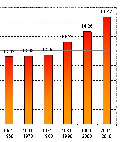
Green tactics IV. The following diagram has been making the rounds of Green discussions since 2013. It is a classic example of scientific charlatanism. The numbers purport to be the average temperature in each decade.
 You will note the rapid rise in the last three decades — a sure sign of global warming, right? If you go to the original source — the World Meteorological Organization (WMO) — and read the paper carefully, you will find that the bars are not averages of the annual temperatures in those decades, as one is likely to assume when looking at the graph (or the title of the article!). The bars actually represent averages of the maximum temperature worldwide achieved in each of the years in those decades. IOW, the bars average ten annual peak temperatures. If one did the same for the minimum temperatures in each decade, those bars would slope downward symmetrically since the ’80s.
What this graph is actually showing is that weather is becoming more erratic since the ’80s, when the THC started to shut down. While the average temperature did not change much, the peaks and valleys became more extreme. One of the things predicted by models of the THC shutdown, and demonstrated in the geologic record for the transitions of past interglacial hiatuses, is that weather becomes extremely erratic during the transitions around hiatuses. In fact, the decade ending in 2010 had the most erratic weather worldwide in recorded history. (Alas, things will get a lot worse as we transition back to a glacial epoch; for example, ARkStorms — hurricanes hundreds of miles across that sit in one place for weeks with 200 mph winds while dropping 400 inches of rain.)
What is unconscionable to me about this graph is that it was the centerpiece of an article entitled 2001-2010: Warmest Decade Since Record Keeping Began. That is factually correct because global warming did not pause until the mid-’90s, so the 2001-2010 decade must be the warmest complete decade on record. However, the implications of this graph, which was the centerpiece of the article, and the title itself are unambiguous in driving the point that the climate is continuing to warm at an increasing rate. The article does that even though the data in the graph demonstrates erratic temperature, not rising average temperature, and the Earth’s average temperature has plateaued since the mid-’90s. To me that represents outrageous scientific charlatanism.
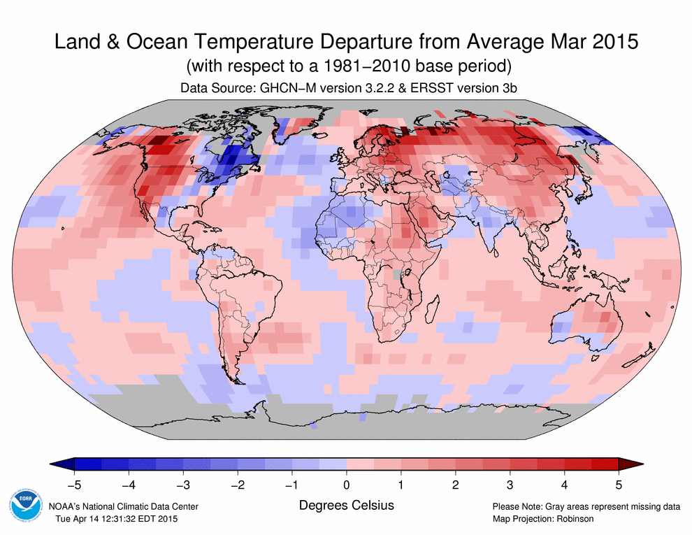
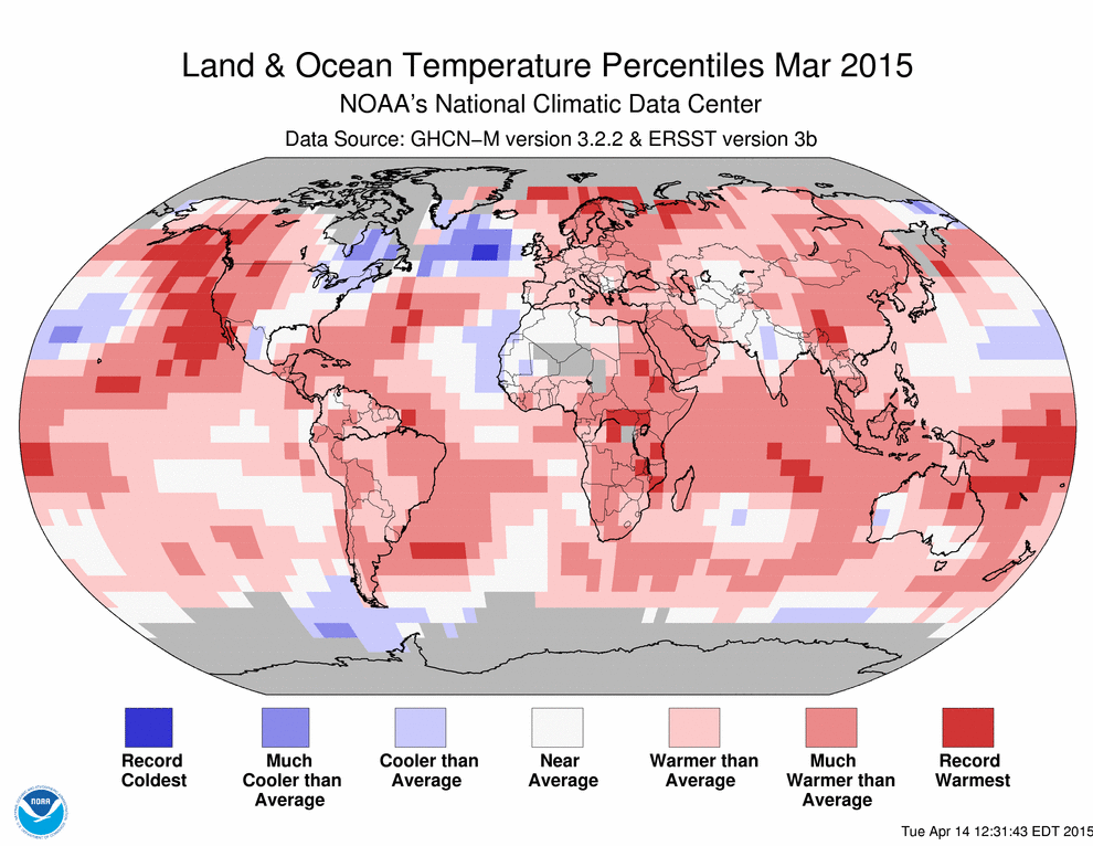
Green Tactics V. There are two NOAA mappings of relative warming and cooling below. The first one is the raw temperature data. The second one has been massaged to show percentages of change. Note how in the second diagram the oceans showed less cooling and the warming areas were more extensive and intense. The way the percentages were computed made warming look far more pervasive and intense than in the raw data. Needless to say, you only see the second diagram on Green web sites.
A far more interesting feature is that areas changed from cooling to warming in several places. The question one has to ask is: how does the sign change when simply converting absolute values to percentages? It can’t — unless you also change the reference datum! Notice that the first diagram specifies the reference datum while the second doesn’t because someone might notice what they are doing. For the second diagram they chose a datum that was an outlier that was unusually cool. This goes beyond scientific charlatanism into scientific fraud because they “cooked” the data to make their point.
The question then becomes: why would they do that? The answer is that they are being remarkably subtle when spreading their message. Hardly anyone reads academic papers from IPCC, WMO, and NOAA. Most people in the public domain get information from the media and from web sites. There are a large number of web sites that preach the Green Message. When a Green blogger wants to make a point and needs a nice diagram from an authoritative source to do that, which one of these diagrams do you think the blogger will use on the web site? Clearly the second diagram makes warming look much more severe and that is going to be the one cited.
But why didn’t NOAA just display the last diagram for the bloggers to copy? Because they would have to identify the reference datum. Anyone familiar with climate data might recognize it as an outlier year and give them flack over that. So they provide both diagrams and let people assume the same datum was used for both and not notice the sign changes. Then the enthusiasm of the bloggers will get the second diagram published far and wide. As a bonus, the bloggers will probably erroneously cite the datum from the first diagram and NOAA will be off the hook for misrepresentation.


